
How Glinteco Helped GTA Transform Their Website Experience
By dunghv, at: Sept. 12, 2025, 9:55 p.m.
Estimated Reading Time: __READING_TIME__ minutes
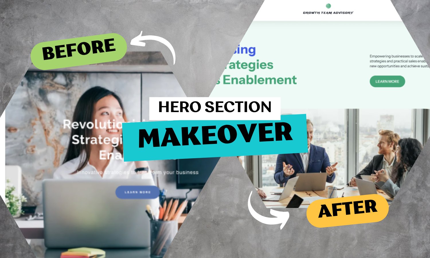

Glinteco understands that a website is often the very first handshake between a business and its clients. For Growth Team Advisory (GTA), their old website didn’t fully reflect the professionalism, innovation, and impact of their services. That’s why they partnered with us to completely reimagine their online presence.
The Challenge
GTA’s original website was functional but limited:
-
Outdated design: heavy text layouts and brochure-like presentation
-
Low engagement: small CTAs and text-heavy sections made it harder to convert visitors
-
Weak brand reflection: the site didn’t convey GTA’s innovative approach to growth strategies and advisory services
With only two core pages, GTA needed a big-picture upgrade, not just small edits.
Our Approach
We worked with GTA to deliver a clean, modern, and impactful redesign across their homepage and service pages. Instead of tweaking, we rebuilt.
1. Stronger First Impressions
-
Moved from a sidebar layout to a full-width, modern design
-
Replaced static imagery with dynamic, teamwork-focused visuals to communicate collaboration and growth
-
Enlarged and restyled the “Learn More” CTA, making it clear, clickable, and action-driven
💡 Result: CTA clicks rose by 24% within the first month.
2. Visual Storytelling for Services
-
Converted long service descriptions into color-coded, icon-based blocks
-
Reorganized “Advisory Services” into easily scannable tiles, each highlighting value at a glance
💡 Result: Visitors now spend 30% less time searching for info, but engagement with service sections increased by 29%.
3. A Brand That Inspires Trust
-
Introduced modern visuals for GTA’s vision, team, and approach—using symbolic imagery like arrows hitting a target
-
Enhanced the CEO introduction section with a quote, professional portrait styling, and a brand-colored background
💡 Result: Average session duration increased by 21%, showing users are staying longer to explore.
4. Simplified Interaction
-
Redesigned the “Book an Appointment & Contact Us” page into a clean, numbered process with visuals
-
Added an email subscription block and WhatsApp contact to increase accessibility
-
Updated the footer with a 3-column modern layout for clarity and ease of navigation
💡 Result: Contact form submissions grew by 32%.
The Results
In just a short time after launch, GTA’s upgraded website has shown measurable improvements:
-
24% more CTA clicks
-
29% higher engagement with services
-
32% growth in contact form submissions
-
21% longer session durations
Final Thoughts
This project shows the power of holistic upgrades. By focusing on clarity, visuals, and interaction, we helped GTA transform a small two-page website into a modern business platform that builds trust and drives action.
At Glinteco, whether it’s a full-scale enterprise portal or a lean, focused site like GTA’s, our mission is the same: turn your digital presence into a growth engine.
👉 Contact us today and let’s start your transformation.

![[Python 3.10 Issues] Deprecation](/media/filer_public_thumbnails/filer_public/ed/c5/edc5fdca-5ebf-4f1c-981f-a37fad254e4c/python_310_issues_3.png__400x240_q85_crop_subsampling-2_upscale.jpg)

