The Cost of Complacency: How Outdated Website Design Erodes Trust in Financial & Professional Services in 2025
By antt, at: Nov. 11, 2025, 5:15 p.m.
Estimated Reading Time: __READING_TIME__ minutes

The Instant Credibility Test
In the high-stakes, high-fee environment of financial, advisory, and professional services, trust is the core differentiator. Before a potential client ever reads a single case study, your website subjects you to an instant credibility test. If your website looks "safe," "classical," or merely "basic", it signals one thing to a discerning executive: complacency and a failure to innovate.
The Anatomy of an Eroding Design
We identified several key visual flaws in the original GTA design that were subtly undermining their premium positioning:
-
Generic, Uninspired Imagery: The original "About" section used simple, illustrative images like a picture of hands interlocked for 'Our Vision'. While safe, these generic visuals fail to convey the complexity and success of strategic advisory work.
-
Rigid, Static Layouts: The content was presented in a basic, symmetrical two-column grid (image-text). This layout is visually dry , easily scannable, but fails to create any strong visual impact or memorable brand identity
-
Weak Visual Hierarchy: The section titles like "Our Vision" used a basic, bold black font, offering little visual excitement or strategic emphasis

Glinteco’s Solution: Designing for Professional Authority
Our UX/UI goal is to design a site that looks and feels like the successful outcome you deliver for your clients. We introduced several creative and modern design principles:
-
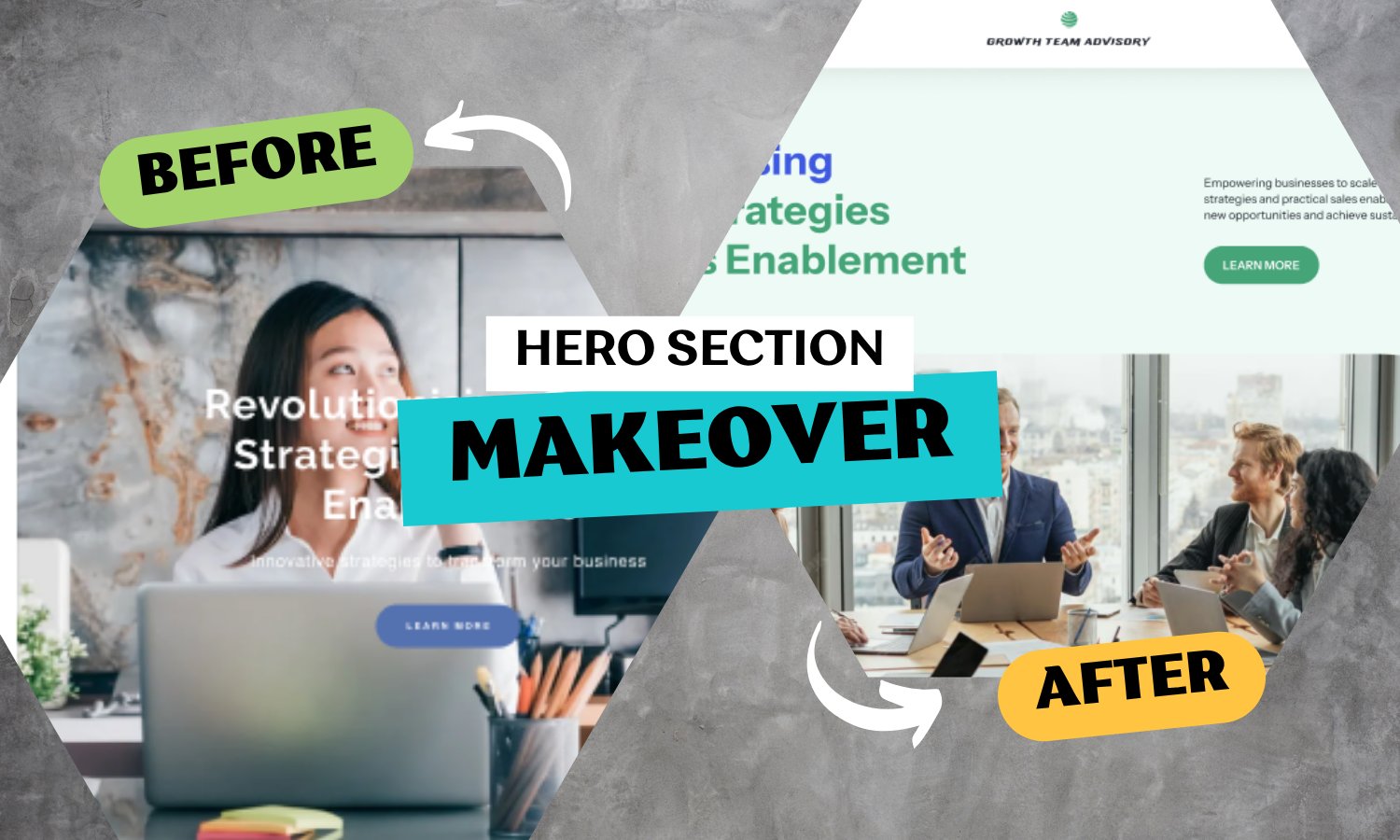
Symbolic, High-Impact Imagery: We replaced the generic visuals with images that communicate a strong, professional message. For 'Our Vision,' we used the powerful, symbolic image of a dart hitting a bullseye. This instantly conveys focus, precision, and strategic success. For the Hero section, we moved from a single person sitting at a desk to a group of people in a meeting, powerfully suggesting teamwork and business growth
-
Fluid, Dynamic Design Blocks: We broke the rigid symmetry. The new layout uses asymmetrical, creative blocks with soft curves and rounded imagery. This creates a sense of visual movement and a cutting-edge, high-end feel.
-
Strategic Color and Emphasis: In the "About" section, we introduced the brand's primary colors to highlight each element, using green for Vision and blue for Team. This small detail makes the page more engaging and helps reinforce brand recognition.
By partnering with Glinteco, your firm moves beyond simple aesthetics to an intuitive, modern design that immediately reinforces your premium status and inspires confidence in every visitor.